Robert Doisneau

Robert Doisneau

Monday, 6 December 2010

10 X 10 X 10

The second project of the specialism was 10 x 10 x 10. It was a 2 week project and I absolutely loved it!!!

The first week I had to research and come up with ideas related to 10 x 10 x 10. It was quite confusing and thus I researched about random things that came up in  my head such as: triangles, patterns, time and geographic coordinates. This research turned out to be useless because I explored basic things and I didn't go beyond to make it more interesting.
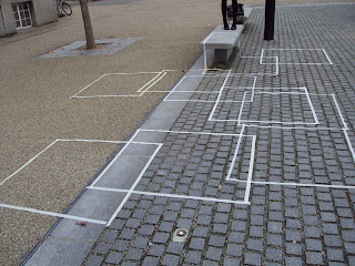
medium scale

Monday I worked on small, medium and large scale research and it was really useful to make me to understand about the importance of scale in 3D and spatial specialism. Plus I've taken some really interesting pictures during this research day.
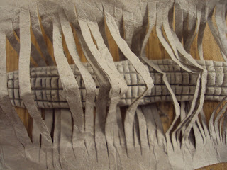
The material experimentation day was really useful as well, I've understood that by manipulating a material I can make it into something far more interesting.
After that I was asked to explore about the word ' to travel '. 
This first week was very structural and very much about experimentation and understanding of what is important in 3D and spatial design. I've found it a bit confusing since I didn't see any connection between my works.

However, during the second week, the brief linked everything together and I finally understood why I was doing what I did in the first week!
I had to create a 10 x 10 x 10 m space related to the chosen topic I researched during the first week and I had to incorporate also the material and scale research.

My topic was to travel, therefore I wanted to create a space where a person can go through and mind travel, 'to feel different'. I researched a lot about the difference between oriental and western interior design and how that affects the way people perceive and live in a space. Based on that,  I've developed many ideas but none of them seemed to work well enough at the start. Therefore, I've spent a lot of time on this project changing my design ideas.

My final design is very different from my initial ideas but I like it and I think it is an interesting design solution to the brief.
It is a tunnel set in a big open space, a person can walk though it and 'mind travel' thanks to the use of lighting to create a specific atmosphere.



The Turner Prize

Today I visited the Turner Prize at the Tate Britain. I found it very interesting because it was very different from the other art and design exhibitions I've been to.

There were 4 artists competing for the prize, Dexter Dalwood, Angela De La Cruz, Susan Philipsz and The Otolith Group. I liked particularly Susan Philipsz's work, when I entered her exhibition room, I was totally captured by her sound piece and I sat there for a very long time just to let myself be fully immersed into the atmosphere of the room.Therefore, in my opinion she should win the turner prize because her work had the most impact on me, and I could notice that her work had a great impact on other people as well since there were many of them sitting in the room. 
I didn't like The Otolith Group's work at all, I just couldn't understand it and there was too much going on in the exhibition room: information overwhelming. 

I've read articles about this prize and found it absolutely confusing, therefore, I enjoyed the exhibition a lot but not so much reading about it. 

Reuse, Remake, Reinvent

The first 3D and spatial design was Reuse, remake, reinvent.

I started this project by researching on John Pawson's Plan stace exhibition, Martino Gamper's 100 chair project, Future systems, Nacho Carbonell and Tom Dixon. I find research really useful since I can get ideas and inspirations for my own project from it.

When I found the piece of furniture on the road.

The next stage of the project was the documentation of my piece of furniture; I've place it in interesting places and took pictures of it, plus I've explored it through a different variety of drawings. By doing this I was able to explore this piece of furniture outside its normal use and look at it in a different prospective.


Following that there was the breaking process of the furniture, it was quite tricky because I had to be careful not to break important parts of the furniture that might be useful in the rebuilt process. However it was impossible to plan what to rebuilt the furniture into, therefore I ended up cutting it into pieces that I thought were visually interesting.

The design and the rebuilt process was fun because I could make anything I wanted and thus I came up with many ideas. But the one I liked the most was a jewelery stall and therefore I made it! It was also fun to learn new ways of assembling a piece of furniture, even though some part of it was quite difficult.

I really enjoyed this project because it was all about exploration and I liked the idea of transforming a piece of furniture into something completely different!


Sunday, 31 October 2010

Crossroads II - Decision!!!


Crossroads II

In these first eight weeks in Chelsea foundation I had the chance to work in different fields of art and design, starting with 3D spatial design, fashion textile, fine art and visual communication. This experience has been incredibly useful in helping me to choose the specialism pathway I want to go into, which is 3D spatial design.
The reason of this choice is mainly based on my interest in this area and because I enjoyed a lot the rotation, in which we were encouraged to look and work with the space around us in a different way by mapping it with strings. I’ve found it very inspiring because I never did anything like that before.  Besides to the observing, mapping and drawing space, during the rotation I also liked working with quick sketch models. I found out that by working quickly and developing many sketch models was very useful for me to process my ideas and come up with a final outcome for the ‘week 2’ project. 
I am especially interested in interior and spatial design, but by looking at my final 3D spatial works I am not sure whether I am good enough to do it.  I like the final outcomes of the 3D spatial design, but I think they fit in more into 3D product design. Then, some tutors have told me that my 3D models were more about the surface than the structure itself. Therefore, I am still quite confused on which area of the 3D spatial design I am good at, but I am sure that 3D is the right choice.
Looking back now, 3D rotation was definitely the most intense one, with a lot of work to do but I feel that it is the right choice for me because I feel confident and enthusiastic when I am working with 3D models. Plus I’ve visited many design festivals and I am always fascinated by other designers works and I can’t stop myself thinking that I might become one of those designers in the future.
Fashion and textile was my second rotation. I found very hard to complete the projects I was given because this rotation was particularly confusing for me. I had a brief but at the same time I wasn’t given a specific target to work towards and I just found myself completely lost in the process of completing the ‘compress and expand’ project, because I didn’t know what was I supposed to be doing and what the tutors wanted. However, even if I struggled during this rotation, the experience was useful for me because it helped me to understand the way I work the best, which is by having a brief that tells me exactly my target, as the one I had for 3D spatial rotation.
The next rotation was fine art. I enjoyed it a lot because we were given the freedom to do anything we wanted to do and it wasn’t “half way” as fashion textile. My final piece was a 3D model of how I see the modern society, I liked it a lot but my peers told me that it was too symbolic and that I should concentrate more on the structure itself.  I think this problem comes form the fact I did IB Visual Arts so my way of thinking is still very tied to that programme and it will take more time to work as a proper artist/designer. 
The last rotation I had was visual communication. The rotation was very challenging because we had to produce loads of ideas in a very short amount of time but this is the reason why I enjoyed it so much because I had to work very fast and I found myself generating ideas that I didn’t even know I was capable of. By the end of the two weeks I did many final pieces that links together to create a unique message: we are incompatible. Since I had a short amount of time I developed many ideas but I didn’t had the time to fully expand each of them, therefore I think I like this rotation but its not for me to work and leave ideas unfinished, because I am a perfectionist and I have to have everything done and finished. In addition, you can see that side of me when you look at my sketchbooks: they are all perfectly organized. I don’t really like that because it sets boundaries to my creativity, I restrict myself when I should be taking risks and developing more interesting ideas by using the sketchbook in a more creative way. Therefore I think this is also a point I need to work on in order to improve myself.

Friday, 29 October 2010

Vis Com

Vis Com has been a very intense rotation. I was asked to produce a wide range of work in a very short amount of time.

The first week we had to develop a sequence / storyboard by collage and drawing. It was a bit hard because I wasn't particularly good with collage and combining drawing with collage...! but at least I attempted and the final result of it is ok, but I think if I had more time I could improve it because after the first few of them I was becoming better...but I just didn't had enough time to do more of them. Some examples are below. 


During the second week we had to do a project called the 'unspoken message'. We had to think of a sender, a receiver and a message, plus we had to come up with a clever and inventive way to deliver this message over a period of time. 

I brainstormed many ideas for this project, all of them deeply related to my personal experience, so personal messages. I think that was what the tutors wanted us to do, because in this way we were able to develop the message fully. My messages were about my ex boyfriend, my best friend which is now far away from me and so on.

However, my final idea is about my ex boyfriend and my message is : we are incompatible. Some of the work is below. I am not gonna explain it because it's vis com...the pictures are supposed to be saying something to the audience...see what u can get out from this!


Fine Art

In the first week of fine art rotation we did mostly drawings on the 4 installations in the studio. Following that we did drawings for animation, but unfortunately I didn't had enough time to develop the project and actually make an animation out of the drawings (because there were too few of them).

After that, we had a project called "carnival of the street", so we had to do quick drawings of a busy and a natural area and take pictures of them. I found this a bit hard because I had very little amount of time to do a large amount of drawings, so I ended up with only 10 drawings instead of 20; but I did many pictures in order to support the project.

Then, we were asked to combine the two projects together, which was really fun because by doing that I found out loads of interesting new images!

  
From the images we had to develop our final idea. But we were given the freedom to do anything we wanted and felt inspired by, so it was a really challenging and interesting project. 
My final piece is a model to represent the modern society. The top black structure is supposed to mean that the society is a impenetrable structure and you can't see through it. The writings on top of represent all the influence we get from the society. 
This structure is then linked to a 'brain' by blood wires, symbolizing that the society is poisoning our minds (which is pure --white).

Sunday, 10 October 2010

Designs of the Year 2010

Today I visited the exhibition 'Designs of the year 2010' at Design Museum.
These are the designs I found interesting:

Panda Eyes (interactive). Produced to interact with the viewer and urging them to consider their impact on the environment. 

Hope Chandelier. I love the magic light pattern this chandelier creates.

Sugru. The orange material can be modeled, you can change everyday objects the way you like.

Typographic tree.

Money. I find it a very powerful way of communicating a message. It really makes you think about the value of money in Zimbabwean. 

My favorite. L-E-D-LED-L-ED. It consists of hundreds of red diodes. The viewer can slid them back and forth and create personal patterns. 

Wednesday, 6 October 2010

Fashion & Textile

The project title was "Compress Expand". For compress, we had to think about pressing things together or to reduce in volume. The tutors gave us words such as : squash, make smaller, decrease, crush.  For expand, we had to think about laying things out, to open up; and the useful words were: stretch, enlarge and inflate.

In the first week we worked mainly on breaking away from the 'normal' concept of fashion. So we had to draw some very random drawings. I found it quite confusing because I didn't know why I was doing all those drawings. One of the examples is below.

 
After these drawings, we continued working with 3D models. Some examples are below.

Some 3D models made with different types of papers. We didn't have a specific purpose in creating these shapes, it was more about what we can do with them after we've created them. For example, we could play with scale and transform these models into jewelery or clothing.


There wasn't a final product for this project, therefore I was very confused all the way through the project because I didn't had a target to work towards... therefore, I don't like the result of this project. 

Tuesday, 28 September 2010

Edweard Muybridge Exhibition

I went to Edweard Muybridge's exhibition in Tate Britain.

I didn't know about this photographer but I have seen some of his work, for example the stop - motion images of galloping horses... so it was pretty impressive to find out about the photographer who did the photos I have seen.

The Exhibition was more or less a time-line of the photos he has done; I don't know much about photography therefore I don't really know how to judge the quality of his work. However, the Yosemite photographs were really stunning... absolutely amazing (and I found out later why they looked so good! It was thanks to the 'Sky Shade' technique that Muybridge has developed for his landscape photos, in order to make it more realistic.)

The stop - motion photographs were interesting because you can see the different instantaneous movements; but I was more impressed about the idea that Muybridge developed the basis for the modern cinema with Zoopraxiscope.

Wednesday, 22 September 2010

Anti Design Festival

Today I went to Anti Design Festival and it's been an enriching experience.

I found out that the main purpose of this Festival is to break away from the Commercial Design. Commercial Design is based on 'money' and because of this, in the past 25 years design has lost its individuality. Therefore, the Anti Design Festival is here to bring back the creativity.

Image: http://www.spoonfed.co.uk/system/images/43756/default/anti_design_festival.jpg 

I went only to the exhibitions of Anti Design Festival and all of them were interesting in different ways. The ones I like the most are Londonnewcastle Project and Epic Fail.
  
I like Londonnewcastle Project's exhibition because it shows how real design is supposed to be: many ideas in a confused environment, this is how true individual design ideas are formed and it's not by following the perfect 'monetary' rules. Plus there were workshops in this exhibition so I managed to create many colorful pins!  

The Design Environment
Ideas
 

In this exhibition there were many interesting artworks:
 

I like Epic Fail because it shows the idea that everything can be called an artwork or a design work, even if it's not perfect. In fact, there were all sorts of art and design works at this exhibition and it was interesting to see different types of works because nowadays it is very difficult to have some distinctiveness in the design world.

A pile of random pieces of paper. Design?
Range of different Design Ideas
"We are living in an age where millions of colours became 256. Difference is enemy. Generic culture hypnotises us all into generic patterns, where control is visibly invisible. Danger is replaced by fear. New means upgrade. Art made money stupid, and money made us fools." Anti Design Festival's Journal
I tried to go to the 100% Design but unfortunately they didn't let me in! Because apparently it was 'only business' -.-"